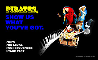
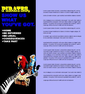
 Here are some layout designs for my Anti-Piracy website. These first two images show a slightly different compositions of the elements. I'm not sure why the blue text is so fuzzy but the second image is my preferred design.
The way the Piano keys are positioned almost acts as an  arrow attracting your eye to the word "Pirates", which is a more logical way of reading.
The way I have positioned the magpie on the microphone suggests that we want to hear the pirates views, which is the direction i am taking this sight in.
Personally I think the imagery and word 'Pirates' is enough to explain the site's purpose. However I will find out through user testing to see if this is the case. If not I will add a short statement explaining its purpose on this page. This 'Take Part' section will be my interative element. The user will be able to post their comments concerning piracy and previous comments. You won't have to become a member to take part as it is an uneccessary procedure and could deter people from posting if the have to fill in a form before hand.
The posts will display in time order and I might include a 'name' field.
The section at the side containing the navigation menu and strap-line will be fixed, so when you scroll down to view  other peoples comments they are always at hand.
At the moment the information pages will follow a similar format. I will try and keep this information concise and unbiased. I do not want this site to make the user feel like they are being nagged but rather informed. In the same way, if this site was to go live I would only remove comments if they are offensive. By giving people free rein to say what they feel and perhaps suggest methods of addressing piracy, a lot could be learned.
Although I think the strap line it is ok, could be improved and will try to work on this. I am either going to try a pirate-linked pun or try to work with song lyrics...
Wednesday, 28 October 2009
Simulated Client:Website Layouts
Subscribe to:
Post Comments (Atom)
0 comments:
Post a Comment