The bit I find especially funny is around 2.35 mins in
"take the food you like the most, cut it in half and you can have twice as much"
0
Little Britian_Fat Fighters
0
Sweet Tooth

SWEET TOOTH™ is a translucent white plastic packaging-a handy hideaway for your secret sweets
Came across this doing a Google search for "sweet tooth" thought it was quite amusing....
0

9.144metres
Skoda Advert
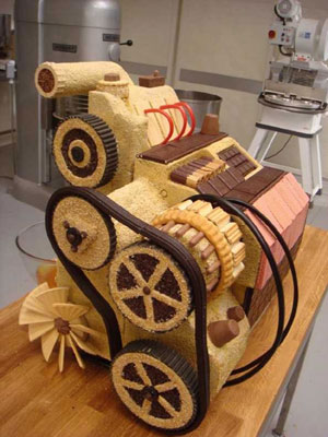
Interesting Cakes
![]() Largest Tiramisu
Largest Tiramisu
The world’s largest tiramisu weighed 305.95 kg (674 lb 8 oz) and was made by the Alpini Group of Caronno Pertusella and Bariola in Caronno Pertusella, Varese, Italy on April 22, 2007
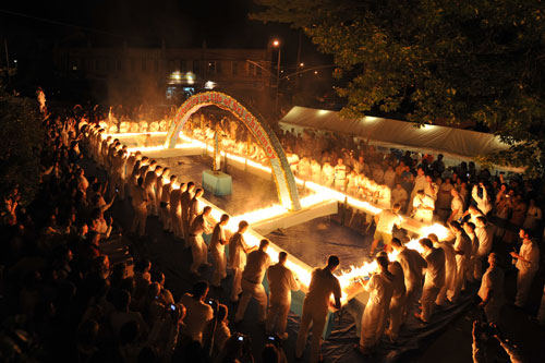
Most Candles
Guinness world record champion Ashrita Furman set a new world record with an international team in Queens, New York, by lighting 48,523 candles to burn simultaneously on a huge cake."
http://www.srichinmoybio.co.uk/news/ashrita-furman-guinness-world-record-breaker/records-for-candles-on-cake/
http://www.srichinmoybio.co.uk/news/ashrita-furman-guinness-world-record-breaker/records-for-candles-on-cake/

Largest Wedding Cake
9.144metres
Skoda Advert
0
L3TT3RP00L

Letterpool is a community based project that is attracting Liverpudlians to upload typography based images from the liverpool area, past and present.
0
![]()
One Million Points of Light is a website "launched by British artist Andrew Pepper in February 2006.
It's aim is to produce a collaborative work which can be seen globally, anywhere there is an Internet connection and computer. This might include your home, a gallery, library, restaurant or public space. One Million Points Of Light is currently being seen in 92 countries!
The concept is simple - you, the visitor to this site, are invited to "switch on" a block of 'Internet' light on the project's homepage. and position this anywhere within a screen made up of one million points. Over the following three years the screen will fill as more and more blocks are illuminated. Eventually the finished image will have been 'drawn' by many individuals from hundreds of locations around the world."
http://www.onemillionpointsoflight.com/faq.php 30/10/08
0
CAKE!
For this first term we were asked to create a 3+ page website based on content of our choice. On these pages have to be 3 flash elements, all of different sizes and exploring a variety of interactivity.
The content I have chosen is cake. This choice was mainly down to having a sweet tooth, but also because I didn't really take to the idea of basing the website on an inspirational artist as i've been doing things like that since year 7.
I want to use photography and source my own images. Baking and making as I go. Jam Doughnut
Everyone knows there is a strategy to eating a jam doughnut and I'm sure most people know the great game that is 'don't lick your lips' . With these two ideas in mind, i instantly thought-GAME! This would be a game of concentration and multi-tasking. The user will have to continuously press a key on the board while select where to take a bite with the mouse. (If I can) I will create levels where these tasks (or similar) will become more complicated or maybe introduce a countdown clock... Round The World
Another idea I had would be an interactive globe. This would have the locations of where certain cakes originated e.g. Madeira
I might include other concise and interesting/quirky facts Loading...
I have two ideas at the moment. The first being an oven: a counter at the top indicates %age loaded and when loading is complete the oven door pops open. The other was a fairy cake with a candel which melts dependanton loading time.
Navigation....
Again I have a few ideas about how to design navigation. I want it to be clear and easy to use but i also want to avoid the typical navigation bar layout.
One idea I had was to create a multi-teired cake; with each tier will take you to a different page.
Alternatively I could have a range of ingredients, or maybe have a slice of cake 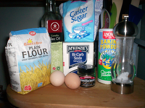 with each layer linking to other pages.
0
The nail box
 Over the summer my Mum set up a mobile manicure and pedicure company, and she asked me to design a logo, letter header, business card and a flyer for The Nail Box.
The audience 'The Nail Box' is aiming to attract would be the older woman, so I wanted to keep the information clear and concise and the design uncluttered but attractive to the eye. The squares come from the word 'box' in the companies name  and the butterfly symbolises rejuvenation.
I used photoshop to develop the designs although I think using Illustrator would've been beneficial, that's why this year I want to learn how to use the program. Who knows in a few months time I might be able design her a website too!
0
DiGiTaL wAlLpPapEr
 I saw a documentary last week about a graduate-Christopher Pearson. For his degree show he created digital wallpaper inspired by a William Morris design. The owner of a London restaurent was so impressed he commisioned the young graduate to cover a whole room with it in just 6weeks.
I found the documentary really interesting as it followed Pearson through design and deveopment processes and also elaborated on the problems he encountered. However the concept was what interested me most. Its quite a simple idea, yet it is extemely effective and clever.
click to view
Tue 14th, 13:30 – 13:45
Designers Under Pressure: Employement documentary
article
When researching this i also came across this site. The site isn't particularly user-friendly but it has some interesting images and it explores more ways of creating multimedia wallpaper.
0
Lecture Task

ITEM 1
This interview with Dan Saffer, is very informative. He goes into quite a lot of detail and also gives good links. He gives incite into his world and some good advice to the budding designer.
His personal site
His blog has a lot of quirky posts. I find it interesting to see the way designers find inspiration. He also has written a book: Designing for Interactive
Other links mentioned:
Stamen Design
Stimulent
Dopplr
ITEM 2
Through Joel Schafers brief answers to the interviewers questions, he parts with some quite useful links
Cap & Design- a Swedish magazine for...
Web Desiger- English magazine Dope Awards
Kirupa
Flash kit
jsgd.se
strange fruits
IDEO
This website instantly grabbed my attention with its bold purple hompage and interactive elements. I hadn't come across IDEO before so I wanted to know who they are. This was answered straight away, by hovering over 'WHAT WE DO' giving me no time to get distracted or loose interest.
As you navigate yourself around the site, the visual stimulus depreciates some what as the site's objective turns to a functional website with informative, however interesting content; rather than design. This made me feel a bit let down to a certain extent....
The site is quite easy to navigate around although I felt a bit overwhelmed by the quantity of links.
SONY
Sony have clearly designed this site to suit the audiences needs. This site is funtional. People will visit it wanting to find information or purchase their products and thats exactly what they can do. It has some nice elements of design like the bar at the top but interactivity is minimal and I didn't feel any urges to explore the site. Like the Sony brand i'm sure its faultless in its funtionality and usability, however some elements of flare would make it more visually stimulating.
APPLE
very much like Sony's site; the design of the website is quite simple which makes the information easy to navigate to. This site is for people wanting to buy apple products and so it gives the audience the information they need and doesn't over complicate things with fancy design.
NOW
I'm not a great fan of the new VLP. The main thing that I find a bit frustrating is the layout. The areas of the site that are used the most (timetable, email etc) are small and squashed at the top of the page while the rest of the page is covered with unuseful information and white space. Its trying to be a social network, with your own profile and buzz, which is also hidden.
One benefit is the library search which takes you where you want to go quite painlessly.
The visual design is very simple and unlike the VLP you can't adjust any settings apart from the font and font size as far as I can make out.
FWA-flash content
(3) For 2 websites with FLASH content from http://www.thefwa.com/ discuss them in your online journal using the same criteria as above.
(4) Have a look and go at the FLASH tutorial available for FLASH CS3, via a link in top right hand widget on the Exploring Multimedia homepage, do this before the seminar in Week 14 28/10/08.
0
New Art Exchange
![]() We visited The New Art Exchange this week which was showing the 'Next We Change Earth' Exhibition. Although there wasn't that much there; it was more a question of quality than quantity. I especially liked the white legs and 'Coloured Black' by Micheal Forbes.
We visited The New Art Exchange this week which was showing the 'Next We Change Earth' Exhibition. Although there wasn't that much there; it was more a question of quality than quantity. I especially liked the white legs and 'Coloured Black' by Micheal Forbes.
They're website is quite well designed. The Hyson Green area has been one of cultural differences for some time and the website reflects this with its use of visual over written communication where possible. It has a simple layout; making it easy for anyone to navigate around the site irrelevant of technical capability or culture. However this does have its drawbacks. The image is often cut off by a smaller monitor screen and there is a feel of limitation as all the information is in its simplest form. The gallery also follows this theme, with no informa


Subscribe to:
Posts (Atom)