 My idea is inspired by a Guest Lecturer we had last year. I started thinking about creating a collaborative site, where the user could see it evolve and take part in its evolution.
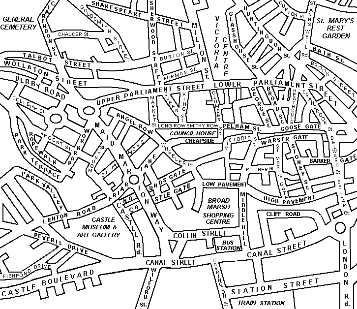
I would have an interactive map of Nottingham City Centre. There would be hot spots on the map which when rolled over, would reveal speech bubbles. These speech bubbles would contain anicdotes left by previous users. This could be anything from, "It was here where I proposed to my wife" to "this is where me and a friend saw a pigeon with a cup on its head". I want this to be accessible to everyone without the hassle of log in's however, if they want to take part then details will be required. I will only ask for name (i will leave this broad so the user can choose whether to leave first name or full name) age and home town aswell as the comment field. This information will then follow the anicdote.
Each hotspot could only display the last comment made and areas that may attract more interest e.g.The Broadway or Market Square, could have their own profile to prevent over crowding and to allow the user to view all the comments.
If i get ahead of myself i could look into allowing people to upload images, although i would then have to create some way of screening these for inappropriate content.
A progression of this site could be to show the journeys the individuals have travelled. This would use the info they entered for 'home town' It could then be possible to create a map with coloured lines coming from all over Britain to Nottingham.
Social site idea
Design Layouts
 Here I have moved the navigation above the 'About Us' bubble. I think this gives a more sensible layout. The information at the side is still there and I've added a 'Do we Deliver to you' text field where I hope to allow the user to enter their postcode to see if they are applicable for home delivery.
 By adding a picture i think a user will instantly recognise the purpose of the site. Eventhough the title of the restaurant explans what they do perfectly well, images provide instant recognision. I also think adding this image has started to make it look more professional.
 Here I have changed the text colour to navy and put a pale blue box behind the telephone number.
 This mint green is closer to what i want, and i much prefer the number being raised just underneath the links, feels more balanced.
 The pink in this designs is far too girly, although pastels often can be used to represent freshness, it still doesn't suit a restaurant.
 From Tarn Thai's Contact card I took the logo and also the colour scheme to. I don't think these colours reflect a thai restaurant though. When I think of Thai I think of freshness, tranquility and quality.
Tarn Thai
When researching various restaurants' websites, Tarn Thai really stood out due to its lack of design and sheer awfulness! I was intrigued by it though as I found this site through Nottingham's Restaurant Awards where it had been nominated for Best Oriental Restaurant in 2007 and 2008. With this in mind I went to visit the restaurant and found that it was stunning! This has made me want to do a re-design of the website to do it justice. From my visit I took a take away menu and a contact card. This has the majority of information I need. So from here its design, design, design!
The New Age of Search Engines
 Windowshop
This is Great! Its owned by amazon and gives you a tour of all their best sellers : books vidoes and games. but the way you navigate is really quite ingenius, its through the arrow keys and for the music you even get samples tracks from the album as well as information and pictures.
Picclick
on the same vein, ebay have bought this. it basically searches all ebay listings however, instead of displaying them as you do on the ebay website, you get a grid of thumbnails with basic info such as price. The order can still be sorted into price, ending soonest, etc

Paul Wyatt

Writer, Animator and designer, Paul Wyatt has worked with many big name brands including, Sony, BBC, Virgin Media, British Airways and Smirnoff. He is a regular contributer to .net magazine which is where I came across his name.
Looking through his site he has some great work I especially like some of his animations such as Same Sky and Meet Max. Unfortunatley i can't provide links as the site is purely flash, but i would recommend a visit.
CSS Tutorial div tags
This CSS tutorial by Geoff Blake is worth a look at. Its given me an understanding of div tags and will definately be using the techniques in my next project.
Restaurant Website Critique
 The French Laundry
This American restaurant is voted as one of the best restaurants in the world. The website is strangly quite relaxing, and does have a certain 'french' feel. It is a flash site, although it isn't flashy and has a simplistic and balanced layout. Barnes Grill
Owned by Antony Warrel Thompson, the Barnes Grill website is flash based. Aesthetically this website is very appealing, however it acts as a microsite to his other restaurants so it has links to these. But these links are to big in comparison to the content window, that very little room is left for information and they dominate over the links concerning The Barnes Grill. To over come this problem the designer has created scroll bars. I'm not too keen on this idea as it can get quite frustrating having to keep scrolling all the time. Especially when there is so much 'white space' round the edges.
 The Club
This Flash site gives the impression of a young, trendy and modern London restaurant/bar. The key to this site is its simplicity, with a few concise links allowing for easy navigation leading to all the information you might need. Its a great example of good design. The purpose of the site is clear, the links are where you would expect them, and subscription is positioned so that you are aware of it there but it is easy to ignore if you so wish. There is no need for the user to search the page for anything, and the information isn't clouded by flowery descriptions, everything has a purpose.
 Marlybone 108
Although this website is aiming at a more mature audience, in a lot of ways is very similar to that of 'The Club'. It has key images and transparent boxes that contain the content. The colour scheme gives a impression of freshness and good quality and generally the site is well thought out. However, I'm not too keen on how the menu is displayed-a PDF in a new window. The only thing I would say is that the text is quite small and especially as they have an older target audience, this could prove problematic for people with bad eyesight. If I were to be really picky Iwould also make the darker bar with the sub categories perminant so it wasn't a roll-over effect.
 Fifteen
This London based restaurant is owned by Jamie Oliver and as expected the website is well thought out and aesthetically pleasing. This site acts as a microsite, linked to all his other restaurants and products. All of which have their own identity all of which made by The Plant. The design itself is quite clever, addressing quite a large ranged audience although at times the quantity of text and links does seem overwhelming and would benefit from being reduced.

TarnThai
This website is the worst site I have come across and I can't think or anything positive to say. They have chosen a horrible poo brown for the background, chucked some almost irrelivant images where ever they happened to land and whats with the tacky waterfall animation?! not to mention the links with their orange background and basic blue link text. There is far too much text on the pages and with very little sub headings and ilogical layout the user is left feeling quite lost! This restaurant was a runner-up for the Best Oriental Restaurant by Nottingham Restaurant awards in 2007, so i'm sure its a good quality restaurant its just a shame they don't have a site to reflect that.

 W1
W1This restaurante is owned by Gary Rhodes and it really reflects his stlye of food: fancy but not pretentious. I was really impressed by this website. It has elements of quirkiness that make it quite entertaining to navigate through. The design and animation is of a high standard and navigation is pain-free. I did notice however that on a couple of the Brasserie menus, the last dish is cut off but this is honestly the only fault I can see.