Colle Mcvoy are an American company that have an extremely impressive portfolio of work. I came across them when i found their Snowdin website on theFWA. However it turns out i have seen their work before without knowing when I visited the Yearbook website. After researching more of their work I think i might add it to my list for sites to keep an eye on. The majority of their work is highly interactive and they definitely have their finger on the pulse.
Snowdin
This is a great site created by. It features 3D cinematic technology that requires 3D glasses. You can request these and get sent to your house; although they are not essential they will improve your enjoyment. It has numerous games and things to download and the navigation has been planned in such a way that it keeps you interested. The only negative a would say it has is that you can't turn off the irritating sleigh bells!
Yahoo
"The Yahoo! Messenger Emoticons want to spread some holiday cheer. Create a personalized carol, then send them off to the digital doorsteps of your friends and loved ones."
This is one i did myself!
YearBook Yourself
Colle Mcvoy
Recipe page
 After saying i didn't like my logo with the Jazz image behind I've decided to go with it. Viewing the white background on a different screen with fresh eyes I don't know what i was thinking!!
 Anyway, i have developed some of the pages and am now putting them into html. Its going well!
After reading the 'Art & Science of CSS', allowing for people that have images and css turned off so they can still access and use the site. I am doing this by covering up text with the images with 'span' tags. This is giving me a grasp of css and although taking a bit of time is extremely worth while. Check it out (only at uni)


I’ve been thinking for a while that I’d like to change my design and style for my site, to give it more individual character. The illustrative design and pastel colours suit the content but for me, it s a very obvious style to go for. Jacqueline Wilson’s books are great for teenage girls, but I want to
appeal to a wider audience.
I had a bit of a brain storming session and touched on a scrapbook style using post-it notes and Polaroid photos, notice board pins and handwriting with hand drawn illustrations. Inspiration coming mainly from Jamie Oliver’s cooking programme. But again, it’s not
exactly original! Then I got thinking about trying to use photography again because I didn’t actually do anything with those sweet images I took. I started fiddling around with these stencil type logos in Photoshop. I like the idea and the second one  is my favourite, but for some reason they just don’t grab me. When creating them though I just happened to hide the hundreds and thousands layer and the resulting image is image 6. I really
  like this. It is simple but has its own style. I want to develop it a bit more by exploring different textures and also making it out of paper instead of it being completely computer generated.
If I pursue this idea, (which I think I should considering the time scale!) the rest of the site will be very minimalist with one key image on each page and quite a lot of white space. I might explore incorporating post-it notes, torn edges etc.

mug
polish company who specialise in animation and interaction. prime example of over snazified website. The download progression is shown really well Tenfold
an excellent example of simplistic design at its best. I really like the wa the background colour changes everytime you change the page. Use of consistent layout and fonts, keeps you aware you are onthe same site but it adds a sense of play so an otherwise plain site design.
Glug Nottingham
I have just been to Brownes for the event that is Glug and am so excited that I have to blog straight away. I went with Ed Christie who through a very random occurrence knew Tim, one of the filmmakers there. This allowed us to jump straight in rather than wait around and nervously approach a group like a predator that should be on prozac. Tim was with 2 others; Richard: an Editor and Ella:the organiser of the event and creative manager. In our short time there we spoke about their job roles and had a really nice chat with them all and are hoping to see them again at the next Glug in January.
This experience has really opened my eyes to how important networking is and especially In the art world. Before I have found myself lost, and extremely nervous about where to begin but I can really see how experiences like this one could potentially open up a entire realm of possibilities and provide a door into the creative industry.
Glug is especially good as it provides the time, place and people. Not only that but the opportunity to be a bit tipsy and swallow any nerves that might arise. I know I felt quite nervous!
Oliver Beaudoin I ♥ U
I love this!!!
Its so simple but so cool! and the music is funky too. Its got me really excited about doing more animation. It reminds me of an animation I did for my Foundation year with the limited colours and silhouette style but obviously his executed with much more sophistication.
Other youtube Gems
Grocery Shop Boyz
 One idea I had was to create a Fruitmachine type interaction. This would act as the 'animated introductory section' that we were required to create. It would allow the user to stop and start the tweened animation by simply clicking the stage and also have a 'skip' button as required.
Another idea was to create a little car that would drive to 'The Grocery Boyz' shop. This would be in a similar 2D stlye of the image below.
For the main site i had a few ideas. I originally thought of this theme....but after a brain storming session I came up with some improved ideas. One I had was to simply use images like the ones below as the background. These would be different on each page and there would be a white area for the content.


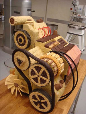
While searching google for inspiration; I came
 across this image.
I also found this...
 and this by Brendan Jamison, made from coloured wax. He also has a series of these ranging from JCB buckets to helicopters. Other mediums he works in are sugar cubes, wool and the more traditional:bronze.
I wanted to create a simple but novel way of navigating through my Cake site so i thought i would do some research. When doing a google search for 'quirky websites' i came across this site by david blesser. It allows the user to control the aanimation below by using the keyboard and in turn creating a variation on the dance. Each image is assigned a key and when pressed displays the image. Although this is quite irrelvant to what I am doing it made me chuckle and so I thought I would share.
Recipes Page

These images show a few variations to my recipe page. The little cup cakes are going to reveal the links destination, just like the 'home' animation I posted in 'SoFar...'.
This first blue image is the winner I think. The cupcakes being on the side indicates they have a function as it relates quite closely to the users expectations. I do quite like the style of these pages, although I am conscious they are looking like the illustrations in a Jacqueline Wilson book!
Bannerblog

I searched Bannerblog after Shaun mentioned it in one of this weeks lectures and came across this interactive banner advertising a Charity fighting against HIV in Africa. I think this banner is great, it not only illustrates how easily and rapidly the disease spreads but also informs the audience of the relevant information with very few words. the only negative i would say this banner has, is that you have to interact for quite some time before the purpose is revealed. I think it would improved by having a time delay triggered by the intial interaction.
Salvador Dali- Metamorphis of Narcissus
SO FAR....
Preloader...
Here are a few versions of preloader. I wanted to keep to a simplistic design but I'm not 100% on what one I will use. I prefer the first and third one, but after asking the opinion of a few of my friends I think I will keep an open mind...

Logo
I did this when I was just playing around in Illustrator. It was a bit of an accident as I was trying to achieve a 'neon sign' look, (because a black background is more energy efficient -blackle.) but I really quite like the simpler, illustrative look.
Home
This will count as one of my interactive elements. When the user hovers over the cupcake, this movie will play allowing clear navigation to the other pages on the site. As the function is hidden, I will keep to the standard website layout and have these on the left hand side. This way the user will not have to spend time searching for the links.
I took these photos with the intention of cropping them into thin strips a using them as backgrounds or separators. Now that I have changed the 'look' I was going for I'm not sure if I will use them...
Fireworks Banner

We were asked to create a flash banner promoting firework safety that appeals to all ages. This should aim particularly to families and incorporate inteactive elements.
Links to firework safety advice
fireservice
saferfireworks
fireworksafety
rospa
berr
fire
Rhyme and history of Guy Fawkes
Flash Tutorials
Who will the audience be?
The audience is anyone of any age although we were asked to create a design that would appeal especially to families, although personally I think the people that need to be educated on the topic of firework safety are teens.
What message needs to be communicated?
That fireworks are potentially dangerous in the wrong hands and you can still have enjoy fireworks while being safe.

How will FLASH appeal to the intended audience?
FLASH elements attract the audiences attention by allowing them to interact. This encourages the user pay attention to the message that is trying to be passed on.
What are your designs for the visual appearence?
How will the interaction work?
Does the interaction increase the ability to communicate the intended message, how?
Little Britian_Fat Fighters
The bit I find especially funny is around 2.35 mins in
"take the food you like the most, cut it in half and you can have twice as much"
Interesting Cakes
 Largest Tiramisu
The world’s largest tiramisu weighed 305.95 kg (674 lb 8 oz) and was made by the Alpini Group of Caronno Pertusella and Bariola in Caronno Pertusella, Varese, Italy on April 22, 2007
Most Candles
http://www.srichinmoybio.co.uk/news/ashrita-furman-guinness-world-record-breaker/records-for-candles-on-cake/
Largest Wedding Cake
9.144metres

Skoda Advert
L3TT3RP00L

Letterpool is a community based project that is attracting Liverpudlians to upload typography based images from the liverpool area, past and present.

One Million Points of Light is a website "launched by British artist Andrew Pepper in February 2006.
It's aim is to produce a collaborative work which can be seen globally, anywhere there is an Internet connection and computer. This might include your home, a gallery, library, restaurant or public space. One Million Points Of Light is currently being seen in 92 countries!
The concept is simple - you, the visitor to this site, are invited to "switch on" a block of 'Internet' light on the project's homepage. and position this anywhere within a screen made up of one million points. Over the following three years the screen will fill as more and more blocks are illuminated. Eventually the finished image will have been 'drawn' by many individuals from hundreds of locations around the world."
http://www.onemillionpointsoflight.com/faq.php 30/10/08
CAKE!
For this first term we were asked to create a 3+ page website based on content of our choice. On these pages have to be 3 flash elements, all of different sizes and exploring a variety of interactivity.
The content I have chosen is cake. This choice was mainly down to having a sweet tooth, but also because I didn't really take to the idea of basing the website on an inspirational artist as i've been doing things like that since year 7.
I want to use photography and source my own images. Baking and making as I go. Jam Doughnut
Everyone knows there is a strategy to eating a jam doughnut and I'm sure most people know the great game that is 'don't lick your lips' . With these two ideas in mind, i instantly thought-GAME! This would be a game of concentration and multi-tasking. The user will have to continuously press a key on the board while select where to take a bite with the mouse. (If I can) I will create levels where these tasks (or similar) will become more complicated or maybe introduce a countdown clock... Round The World
Another idea I had would be an interactive globe. This would have the locations of where certain cakes originated e.g. Madeira
I might include other concise and interesting/quirky facts Loading...
I have two ideas at the moment. The first being an oven: a counter at the top indicates %age loaded and when loading is complete the oven door pops open. The other was a fairy cake with a candel which melts dependanton loading time.
Navigation....
Again I have a few ideas about how to design navigation. I want it to be clear and easy to use but i also want to avoid the typical navigation bar layout.
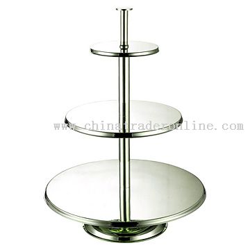
One idea I had was to create a multi-teired cake; with each tier will take you to a different page.
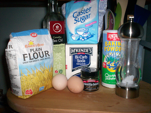
Alternatively I could have a range of ingredients, or maybe have a slice of cake  with each layer linking to other pages.
The nail box
 Over the summer my Mum set up a mobile manicure and pedicure company, and she asked me to design a logo, letter header, business card and a flyer for The Nail Box.
The audience 'The Nail Box' is aiming to attract would be the older woman, so I wanted to keep the information clear and concise and the design uncluttered but attractive to the eye. The squares come from the word 'box' in the companies name  and the butterfly symbolises rejuvenation.
I used photoshop to develop the designs although I think using Illustrator would've been beneficial, that's why this year I want to learn how to use the program. Who knows in a few months time I might be able design her a website too!
DiGiTaL wAlLpPapEr
 I saw a documentary last week about a graduate-Christopher Pearson. For his degree show he created digital wallpaper inspired by a William Morris design. The owner of a London restaurent was so impressed he commisioned the young graduate to cover a whole room with it in just 6weeks.
I found the documentary really interesting as it followed Pearson through design and deveopment processes and also elaborated on the problems he encountered. However the concept was what interested me most. Its quite a simple idea, yet it is extemely effective and clever.
click to view
Tue 14th, 13:30 – 13:45
Designers Under Pressure: Employement documentary
article
When researching this i also came across this site. The site isn't particularly user-friendly but it has some interesting images and it explores more ways of creating multimedia wallpaper.


