Mary Slessor Foundation
I contacted The Mary Slessor Foundation offering my services as I thought their current website was in need of updating. Gary (their contact in Dundee) agreed and gave me a rough understanding of the charity's work. He liked the slightly quirky navigation I have used on my portfolio site and apart from the Mary Slessor logo they had no current branding. I did some research of charity websites and took inspiration from the World Wildlife Foundation. Also with my own website in mind, I took images that reflected the website's pages e.g. History and Our Work. The idea is to have a sentence or two appear when the user hovers over each image. This will allow a first time visitor to have an understanding of the charity straight away.
WelcomePage_Design 1
WelcomePage_Design 2
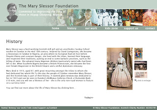
The main site would follow a similar layout to the following images.

I chose horizontal navigation as the vertical created too much wasted space and looks cluttered. I have aligned the navigation to create a balance with the logo, Charity name and strap line on the left-hand-side. The client also had the idea of changing the images on the header to according the the page's content, so I will be taking that idea on board.
The client wanted to incorporate green, as this is the main colour of the Nigerian flag. Although the flag is a 'grassy' green colour, I went for this rather more 'sagey' colour as is suits the design and creates a more serious feel.
The interaction will be followed through using javascript to alternate between pictures.


