Quak Quak


I came across Quak Media via a Google image search and was particularly impressed with these two pieces. The vector illustration I like purely because of the use of colours and attractive swirls but the H2O advertisement is really quite clever. As the mouse cursor goes over the banner, it creates an effect not dissimilar to when you run your fingers/hand through water. Its made me really quite intrigued as to how you might code this...
Web design Company

I came across this site promoting and showcasing New Media Design's work. They are a New Zealand based company and have some really interesting/quirky element in their design...
Make you Mark Screen shots
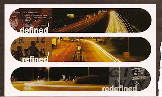
I came across this image in my scrapbook which gave me the idea to incorporate the rounded window. I think this makes it much easier on the eye, reducing the conflict between the modern font and traditional imagery.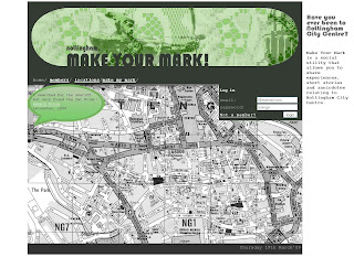
In this screen shot of the new homepage design you can see I converted the map to a black a white image and changed the hue of the comment bubble to match the green in the header. I also repeated the grey in a footer although it is actually a slightly darker than the header, as against different colours you perceive colours differently. I kept the site blurb but positioned it to the right. Although in hind-sight it might be better on the left as we generally read from left to right and as it will be the first thing you see, will apply more importance. I also kept its background white so it isn't distracting for the user.
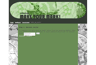
The login box appears on all pages but only when your logged out, its position distracts the eye as it appears 'out of place' and could encourage login and participation.
Bebo Critique
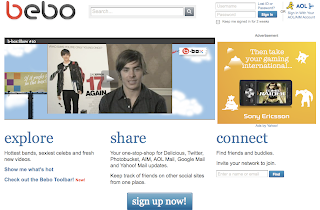 "Bebo" is an acronym for "Blog early, blog often"
This is the homepage of Bebo. If we compare it to that of Facebook's, we see a lot of differences. On facebook's the registration form is already there you don't have to read loads of jargon and scroll down 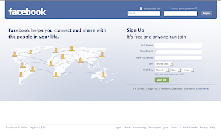 to view the' Sign up now' button. Also login form is clearly visable not hidden away in the corner.
As I am a member of Facebook I am most probably biased, but I wasn't impressed with the layout or design of Bebo. You need to put a lot of effort into the page before it looks any good and I'm not quite sure why there's a huge easyjet advertisement in the middle of my profile page.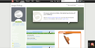 As a 'first timer' I was hard to get started. To find friends there is a search field, but when you get the results of this search there is no image of the potential friend to comfirm if you know them or not. There is also so many sections to a profile and even when looking at a regular users; it looks empty. Although these can be viewed in sections with a series of tabs allowing you to flick between them all.
In a lot of ways it seems very similar to Facebook allowing you to upload video and photos, join groups and instant message. There is a lot of emphasis on link your bebo account with other account such as twitter and Even the top bar is the same, but its just very confusing and to me not very easy to use!!
Reviewing these sites makes me aware of the pit falls of other social networking sites. Simplicity is the key; no one wants to use a site that complicated to navigate around. The fist timer experience is also crucial and will determine whether the individual will return. Its hard enough to get peoples interest so its vital once you've got that interest to keep it!
Facebook Critique
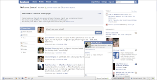 Facebook has taken the online social networking world by storm. Founded by a Harvard graduate, Mark Zuckerberg, membership was originally restricted to Harvard college students where there was already a strong sense of community. Within the first month, more than half the undergraduate population at Harvard was registered. Gradually they opened membership up to more American Universities, then High schools until September 26, 2006 when it opened to anyone of ages 13 and older with a valid email address.
In its infancy, Facebook didn't actually offer anything new over its competitors. In fact in a lot of ways Myspace offered more, allowing the user to personalise their page and add applications such as music players etc. In my opinion Facebook's success is down to the way it was launched: targeting a whole university's students where there is already a strong sense of community.
Facebook is also a lot simpler to use. I was a member of Myspace for a little while but I wasn't that keen on the idea of personalising my page. Although this allows the user to create their own little 'space' and gives their friends a better understanding of their personality; I felt there was a sense of competition, who had the better layout design, music etc. Facebook doesn't have this focus, the design is much more conservative allowing the soul focus to be on interacting with eachother. Its quite conservative design helps to appeal to a very large audience, blue being a safe colour and use of very pale colours makes the content (posts etc) appear more important.
May 24, 2007 brought about the launched of Facebook Platform, providing a framework for software developers to create applications that interact with core Facebook features. To date Facebook has many applications you can add to your page including: games, drawing tools and collectibles. By constantly adding new applications such as Facebook Chat, it keeps users interested
Facebook creates a platform that allows you to keep in touch with people you wouldn't otherwise. For me the main reason for using Facebook is because my friends use it and its quite intruiging to see what they've been up to through viewing conversations, photos. It is also quite interesting know who knows who through the Mutual Friends section.
uses PHP
Make your Mark Redesign
 Since I had put no effort into the design of my website, I thought it was about time to do just that. As the siteis about Nottingham, I took influences from its
history: Robin Hood, The Council House and Lace.I'm not too sure about my choice of font. Originally I thought a handwritten font would suit it quite well but this seemed to contradict the imagery I have chosen.


HBO Voyeur Website-Nosey Neighbours!
Made by American agency Big Spaceship, HBO Voyeur is a theatrical multimedia experience and marketing campaign launched in 2007. As far as i can work out HBO are an American television channel provider similar to Sky. Once loaded this website takes you to a high-rise flat window. By clicking you are then given the choice of zooming into several apartment blocks.Within these apartment blocks you ca instigate the stories of the people living there.
This website is not only clever with the use of technology but also the concept too. It works on the idea of people watching and limitations. Its a human characteristic to be curious about what others get up to and this site allows you to do just that without getting caught! The way only a couple of rooms can be view at 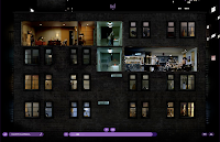 one time(unless you choose otherwise) offers a limited view evoking curiosity and keeps you coming back to view the other stories.
The Elevator Pitch
![]()
Jim Shorthose was talking about this in his lecture on Monday and thought it was quite an interesting idea. Then today I was reading march's .net magazine and the same concept cropped up in a article by Dan Mall, about attracting visitors to your website. This made me think I should blog it to remind me in the future...
The Elevator Pitch Scenario:
You are in an elevator and in the time that it takes to reach your desired floor you have to explain clearly and concisely what you do.
If you are unable to this then you should re-evaluate your synopsis or if your applying this to an idea ou might hav, then perhaps re-evaluate the idea.
In this article they even used the hedgehog and fox analogy!
Make your Mark

The last couple of days I've been quite productive. One user can now log in however the session only runs on the homepage. I have got my 'upload picture' to work and on the profile page, if there is no profile picture in the database the 'upload picture' option appears instead. I have also altered the 
All the content on my profile page has been extracted from the database and I've also got dynamic titles for the profile so it displays "'nickame', Make Your Mark". Profile pictures display now too and the these have been set to a width of 200px.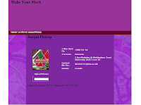 Things to do:
- I still need to work out how to use dynamic CSS to position comments on the map.
- I need to display more than one result from the database as at the moment I can only print to the screen the values associated with the first entry in the database.
- I cannot currently import data into the database through a form, the upload picture only uploads to a file on the server. I know this will be via a Mysql statement and might look into the statements that appear when you do it through the PHPmyadmin tomorrow.
- Invites are also a problem....
Php Login Tutorial
I found this tutorial very helpful it goes through step by step how to create a log in page that verifies with the database.
Why learn PHP??
I don't think I'm the only one feeling a little lost with PHP at the moment, so here are some points that might boost enthusiasm and justify the headaches!
1. PHP has very similar syntax rules to ActionScript. This will help you both in learning PHP, and in improving your knowledge in AS3.
2. Let’s face it, almost every website out there runs on PHP. We cannot change this, so we must change our knowledge to be a part of the many people who use PHP. Some examples of popular uses of PHP are:
- Content Manage Systems
- Browser-Based Games
- Online Applications
- Blogs
Most likely, one of these is going to applicable to what you’re going to do in flash.
3. Out of all the programming and scripting languages in the world, the best match for flash is PHP. They are meant to be together, like husband and wife. There are many ways that Flash and PHP can be used together. Here’s a list of ways they can be used:
- High Scores
- Account Systems
- Dynamic Flash Sites
- Image Galleries




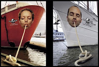
I have a real passion for advertisement. Imagery can be so powerful in conveying an concept/message and there is no end to the possible outcomes. I get so much enjoyment from seeing quirky advertisements like these. They have an element of fun and it is this which grabs your attention and makes the advertisement successful.
I have another blog which has a lot of commercials and posters that i have come across.
Microsoft Surface
Microsoft Surface is a table top touch screen computer that proves the mouse and keyboard defunct and allows for multiple users. There is no need to use leads to connect mobile phones and cameras to the device instead you simply place them on the table top and the images spill out, allowing for reorganising and enlarging with your hands.
Milan is currently aimed at businesses and should be deployed at commercial properties by the end of the year. Its going to be a while before produts like this become a household items, however aspects are already breaking through with touchscreen mobile and notepads.


