 "Bebo" is an acronym for "Blog early, blog often"
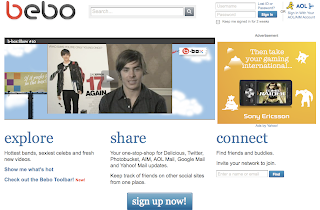
This is the homepage of Bebo. If we compare it to that of Facebook's, we see a lot of differences. On facebook's the registration form is already there you don't have to read loads of jargon and scroll down  to view the' Sign up now' button. Also login form is clearly visable not hidden away in the corner.
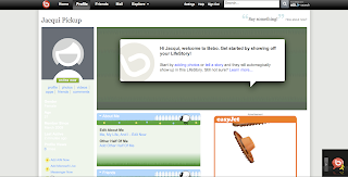
As I am a member of Facebook I am most probably biased, but I wasn't impressed with the layout or design of Bebo. You need to put a lot of effort into the page before it looks any good and I'm not quite sure why there's a huge easyjet advertisement in the middle of my profile page. As a 'first timer' I was hard to get started. To find friends there is a search field, but when you get the results of this search there is no image of the potential friend to comfirm if you know them or not. There is also so many sections to a profile and even when looking at a regular users; it looks empty. Although these can be viewed in sections with a series of tabs allowing you to flick between them all.
In a lot of ways it seems very similar to Facebook allowing you to upload video and photos, join groups and instant message. There is a lot of emphasis on link your bebo account with other account such as twitter and Even the top bar is the same, but its just very confusing and to me not very easy to use!!
Reviewing these sites makes me aware of the pit falls of other social networking sites. Simplicity is the key; no one wants to use a site that complicated to navigate around. The fist timer experience is also crucial and will determine whether the individual will return. Its hard enough to get peoples interest so its vital once you've got that interest to keep it!
Saturday, 14 March 2009
Bebo Critique
Subscribe to:
Post Comments (Atom)
0 comments:
Post a Comment