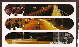
I came across this image in my scrapbook which gave me the idea to incorporate the rounded window. I think this makes it much easier on the eye, reducing the conflict between the modern font and traditional imagery.
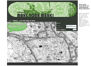
In this screen shot of the new homepage design you can see I converted the map to a black a white image and changed the hue of the comment bubble to match the green in the header. I also repeated the grey in a footer although it is actually a slightly darker than the header, as against different colours you perceive colours differently. I kept the site blurb but positioned it to the right. Although in hind-sight it might be better on the left as we generally read from left to right and as it will be the first thing you see, will apply more importance. I also kept its background white so it isn't distracting for the user.

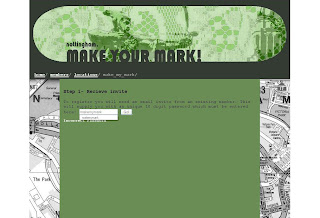
The login box appears on all pages but only when your logged out, its position distracts the eye as it appears 'out of place' and could encourage login and participation.
Friday, 20 March 2009
Make you Mark Screen shots
Subscribe to:
Post Comments (Atom)


0 comments:
Post a Comment