

I came across Quak Media via a Google image search and was particularly impressed with these two pieces. The vector illustration I like purely because of the use of colours and attractive swirls but the H2O advertisement is really quite clever. As the mouse cursor goes over the banner, it creates an effect not dissimilar to when you run your fingers/hand through water. Its made me really quite intrigued as to how you might code this...
Showing posts with label Year2 Interaction Design. Show all posts
Showing posts with label Year2 Interaction Design. Show all posts
0
Quak Quak


0
HBO Voyeur Website-Nosey Neighbours!

Made by American agency Big Spaceship, HBO Voyeur is a theatrical multimedia experience and marketing campaign launched in 2007. As far as i can work out HBO are an American television channel provider similar to Sky. Once loaded this website takes you to a high-rise flat window. By clicking you are then given the choice of zooming into several apartment blocks.Within these apartment blocks you ca instigate the stories of the people living there.
This website is not only clever with the use of technology but also the concept too. It works on the idea of people watching and limitations. Its a human characteristic to be curious about what others get up to and this site allows you to do just that without getting caught! The way only a couple of rooms can be view at  one time(unless you choose otherwise) offers a limited view evoking curiosity and keeps you coming back to view the other stories.
0
Carebears Game

 These are screen shots of my game so far. It is carebear based and follows quite a basic platform style. Controlling Love-a-lot bear with left and right arrow keys and the space bar to jump, the aim of the game is to jump from cloud to cloud, collecting items and reaching the Rainbow at the end of each level.
0
Carebears Intro
This is the Original Carebear Intro. It features a number of the original characters and is the basis for some of my design choices
0
Subservient Chicken

Subservient Chicken is a promotional Burger King website where a man in chicken costume, performs your commands. It is a play on their slogan 'Have it your way'. I recommend visiting the site, it is very entertaining but also quite curious, as it dos everything!!
0
Recipe page
 After saying i didn't like my logo with the Jazz image behind I've decided to go with it. Viewing the white background on a different screen with fresh eyes I don't know what i was thinking!!
 Anyway, i have developed some of the pages and am now putting them into html. Its going well!
After reading the 'Art & Science of CSS', allowing for people that have images and css turned off so they can still access and use the site. I am doing this by covering up text with the images with 'span' tags. This is giving me a grasp of css and although taking a bit of time is extremely worth while. Check it out (only at uni)
0

mug
polish company who specialise in animation and interaction. prime example of over snazified website. The download progression is shown really well Tenfold
an excellent example of simplistic design at its best. I really like the wa the background colour changes everytime you change the page. Use of consistent layout and fonts, keeps you aware you are onthe same site but it adds a sense of play so an otherwise plain site design.
0

 and this by Brendan Jamison, made from coloured wax. He also has a series of these ranging from JCB buckets to helicopters. Other mediums he works in are sugar cubes, wool and the more traditional:bronze.
Grocery Shop Boyz
 One idea I had was to create a Fruitmachine type interaction. This would act as the 'animated introductory section' that we were required to create. It would allow the user to stop and start the tweened animation by simply clicking the stage and also have a 'skip' button as required.
Another idea was to create a little car that would drive to 'The Grocery Boyz' shop. This would be in a similar 2D stlye of the image below.
For the main site i had a few ideas. I originally thought of this theme....but after a brain storming session I came up with some improved ideas. One I had was to simply use images like the ones below as the background. These would be different on each page and there would be a white area for the content.


However, my preferred idea was to use a trolley. The links would run along the handle while there would be the logo on the front of the trolley where they often put advertisements. This would link well to either of my ideas for the 'animated introductory section and could incorporate a photographic or illustrative style.
While searching google for inspiration; I came across this image.
While searching google for inspiration; I came
 across this image.
 Its from this site http://www.trolleywobble.com/trolley.htm. I like this mainly because of its simplicity. Its aesthetically pleasing and quite quirky.

I also found this...

I also found this...
Its quite irrelevant but its very impressive. Its by Ptolemy Elrington is made from a rescued supermarket trolley. He has made a whole range of these on the theme of the riverbed where the trolleys are rescued from.
 and this by Brendan Jamison, made from coloured wax. He also has a series of these ranging from JCB buckets to helicopters. Other mediums he works in are sugar cubes, wool and the more traditional:bronze.
0
I wanted to create a simple but novel way of navigating through my Cake site so i thought i would do some research. When doing a google search for 'quirky websites' i came across this site by david blesser. It allows the user to control the aanimation below by using the keyboard and in turn creating a variation on the dance. Each image is assigned a key and when pressed displays the image. Although this is quite irrelvant to what I am doing it made me chuckle and so I thought I would share.
0
Recipes Page

These images show a few variations to my recipe page. The little cup cakes are going to reveal the links destination, just like the 'home' animation I posted in 'SoFar...'.
This first blue image is the winner I think. The cupcakes being on the side indicates they have a function as it relates quite closely to the users expectations. I do quite like the style of these pages, although I am conscious they are looking like the illustrations in a Jacqueline Wilson book!
0
Bannerblog

I searched Bannerblog after Shaun mentioned it in one of this weeks lectures and came across this interactive banner advertising a Charity fighting against HIV in Africa. I think this banner is great, it not only illustrates how easily and rapidly the disease spreads but also informs the audience of the relevant information with very few words. the only negative i would say this banner has, is that you have to interact for quite some time before the purpose is revealed. I think it would improved by having a time delay triggered by the intial interaction.
0
SO FAR....
Preloader...
Here are a few versions of preloader. I wanted to keep to a simplistic design but I'm not 100% on what one I will use. I prefer the first and third one, but after asking the opinion of a few of my friends I think I will keep an open mind...

Logo
I did this when I was just playing around in Illustrator. It was a bit of an accident as I was trying to achieve a 'neon sign' look, (because a black background is more energy efficient -blackle.) but I really quite like the simpler, illustrative look.
Home
This will count as one of my interactive elements. When the user hovers over the cupcake, this movie will play allowing clear navigation to the other pages on the site. As the function is hidden, I will keep to the standard website layout and have these on the left hand side. This way the user will not have to spend time searching for the links.


I took these photos with the intention of cropping them into thin strips a using them as backgrounds or separators. Now that I have changed the 'look' I was going for I'm not sure if I will use them...
0
Rhyme and history of Guy Fawkes
Flash Tutorials
Who will the audience be?
The audience is anyone of any age although we were asked to create a design that would appeal especially to families, although personally I think the people that need to be educated on the topic of firework safety are teens.
What message needs to be communicated?
That fireworks are potentially dangerous in the wrong hands and you can still have enjoy fireworks while being safe.

How will FLASH appeal to the intended audience?
FLASH elements attract the audiences attention by allowing them to interact. This encourages the user pay attention to the message that is trying to be passed on.
What are your designs for the visual appearence?
How will the interaction work?
Does the interaction increase the ability to communicate the intended message, how?
Fireworks Banner
We were asked to create a flash banner promoting firework safety that appeals to all ages. This should aim particularly to families and incorporate inteactive elements.
Links to firework safety advice
fireservice
saferfireworks
fireworksafety
rospa
berr
fire

Rhyme and history of Guy Fawkes
Flash Tutorials
Who will the audience be?
The audience is anyone of any age although we were asked to create a design that would appeal especially to families, although personally I think the people that need to be educated on the topic of firework safety are teens.
What message needs to be communicated?
That fireworks are potentially dangerous in the wrong hands and you can still have enjoy fireworks while being safe.

How will FLASH appeal to the intended audience?
FLASH elements attract the audiences attention by allowing them to interact. This encourages the user pay attention to the message that is trying to be passed on.
What are your designs for the visual appearence?
How will the interaction work?
Does the interaction increase the ability to communicate the intended message, how?
0
Little Britian_Fat Fighters
The bit I find especially funny is around 2.35 mins in
"take the food you like the most, cut it in half and you can have twice as much"
0
Sweet Tooth

SWEET TOOTH™ is a translucent white plastic packaging-a handy hideaway for your secret sweets
Came across this doing a Google search for "sweet tooth" thought it was quite amusing....
0


9.144metres

Skoda Advert
Interesting Cakes
 Largest Tiramisu
The world’s largest tiramisu weighed 305.95 kg (674 lb 8 oz) and was made by the Alpini Group of Caronno Pertusella and Bariola in Caronno Pertusella, Varese, Italy on April 22, 2007
Most Candles
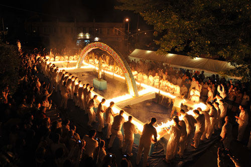
Guinness world record champion Ashrita Furman set a new world record with an international team in Queens, New York, by lighting 48,523 candles to burn simultaneously on a huge cake."
http://www.srichinmoybio.co.uk/news/ashrita-furman-guinness-world-record-breaker/records-for-candles-on-cake/
http://www.srichinmoybio.co.uk/news/ashrita-furman-guinness-world-record-breaker/records-for-candles-on-cake/

Largest Wedding Cake
9.144metres
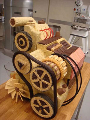
Skoda Advert
0
CAKE!
For this first term we were asked to create a 3+ page website based on content of our choice. On these pages have to be 3 flash elements, all of different sizes and exploring a variety of interactivity.
The content I have chosen is cake. This choice was mainly down to having a sweet tooth, but also because I didn't really take to the idea of basing the website on an inspirational artist as i've been doing things like that since year 7.
I want to use photography and source my own images. Baking and making as I go. Jam Doughnut
Everyone knows there is a strategy to eating a jam doughnut and I'm sure most people know the great game that is 'don't lick your lips' . With these two ideas in mind, i instantly thought-GAME! This would be a game of concentration and multi-tasking. The user will have to continuously press a key on the board while select where to take a bite with the mouse. (If I can) I will create levels where these tasks (or similar) will become more complicated or maybe introduce a countdown clock...
Another idea I had would be an interactive globe. This would have the locations of where certain cakes originated e.g. Madeira
I might include other concise and interesting/quirky facts Loading...
I have two ideas at the moment. The first being an oven: a counter at the top indicates %age loaded and when loading is complete the oven door pops open. The other was a fairy cake with a candel which melts dependanton loading time.
Navigation....
Again I have a few ideas about how to design navigation. I want it to be clear and easy to use but i also want to avoid the typical navigation bar layout.
One idea I had was to create a multi-teired cake; with each tier will take you to a different page.
Alternatively I could have a range of ingredients, or maybe have a slice of cake 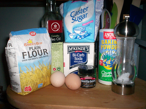

0
DiGiTaL wAlLpPapEr

I found the documentary really interesting as it followed Pearson through design and deveopment processes and also elaborated on the problems he encountered. However the concept was what interested me most. Its quite a simple idea, yet it is extemely effective and clever.
click to view
Tue 14th, 13:30 – 13:45
Designers Under Pressure: Employement documentary
article
When researching this i also came across this site. The site isn't particularly user-friendly but it has some interesting images and it explores more ways of creating multimedia wallpaper.

0
Lecture Task
ITEM 1
This interview with Dan Saffer, is very informative. He goes into quite a lot of detail and also gives good links. He gives incite into his world and some good advice to the budding designer.
His personal site
His blog has a lot of quirky posts. I find it interesting to see the way designers find inspiration.
Other links mentioned:
Stamen Design
Stimulent
Dopplr
ITEM 2
Through Joel Schafers brief answers to the interviewers questions, he parts with some quite useful links
Cap & Design- a Swedish magazine for...
Web Desiger- English magazine
Kirupa
Flash kit
jsgd.se
strange fruits
IDEO
This website instantly grabbed my attention with its bold purple hompage and interactive elements. I hadn't come across IDEO before so I wanted to know who they are. This was answered straight away, by hovering over 'WHAT WE DO' giving me no time to get distracted or loose interest.
As you navigate yourself around the site, the visual stimulus depreciates some what as the site's objective turns to a functional website with informative, however interesting content; rather than design. This made me feel a bit let down to a certain extent....
The site is quite easy to navigate around although I felt a bit overwhelmed by the quantity of links.
SONY
Sony have clearly designed this site to suit the audiences needs. This site is funtional. People will visit it wanting to find information or purchase their products and thats exactly what they can do. It has some nice elements of design like the bar at the top but interactivity is minimal and I didn't feel any urges to explore the site. Like the Sony brand i'm sure its faultless in its funtionality and usability, however some elements of flare would make it more visually stimulating.
APPLE
very much like Sony's site; the design of the website is quite simple which makes the information easy to navigate to. This site is for people wanting to buy apple products and so it gives the audience the information they need and doesn't over complicate things with fancy design.
NOW
I'm not a great fan of the new VLP. The main thing that I find a bit frustrating is the layout. The areas of the site that are used the most (timetable, email etc) are small and squashed at the top of the page while the rest of the page is covered with unuseful information and white space. Its trying to be a social network, with your own profile and buzz, which is also hidden.
One benefit is the library search which takes you where you want to go quite painlessly.
The visual design is very simple and unlike the VLP you can't adjust any settings apart from the font and font size as far as I can make out.
FWA-flash content
(3) For 2 websites with FLASH content from http://www.thefwa.com/ discuss them in your online journal using the same criteria as above.
(4) Have a look and go at the FLASH tutorial available for FLASH CS3, via a link in top right hand widget on the Exploring Multimedia homepage, do this before the seminar in Week 14 28/10/08.


Subscribe to:
Posts (Atom)